Ainsley Report
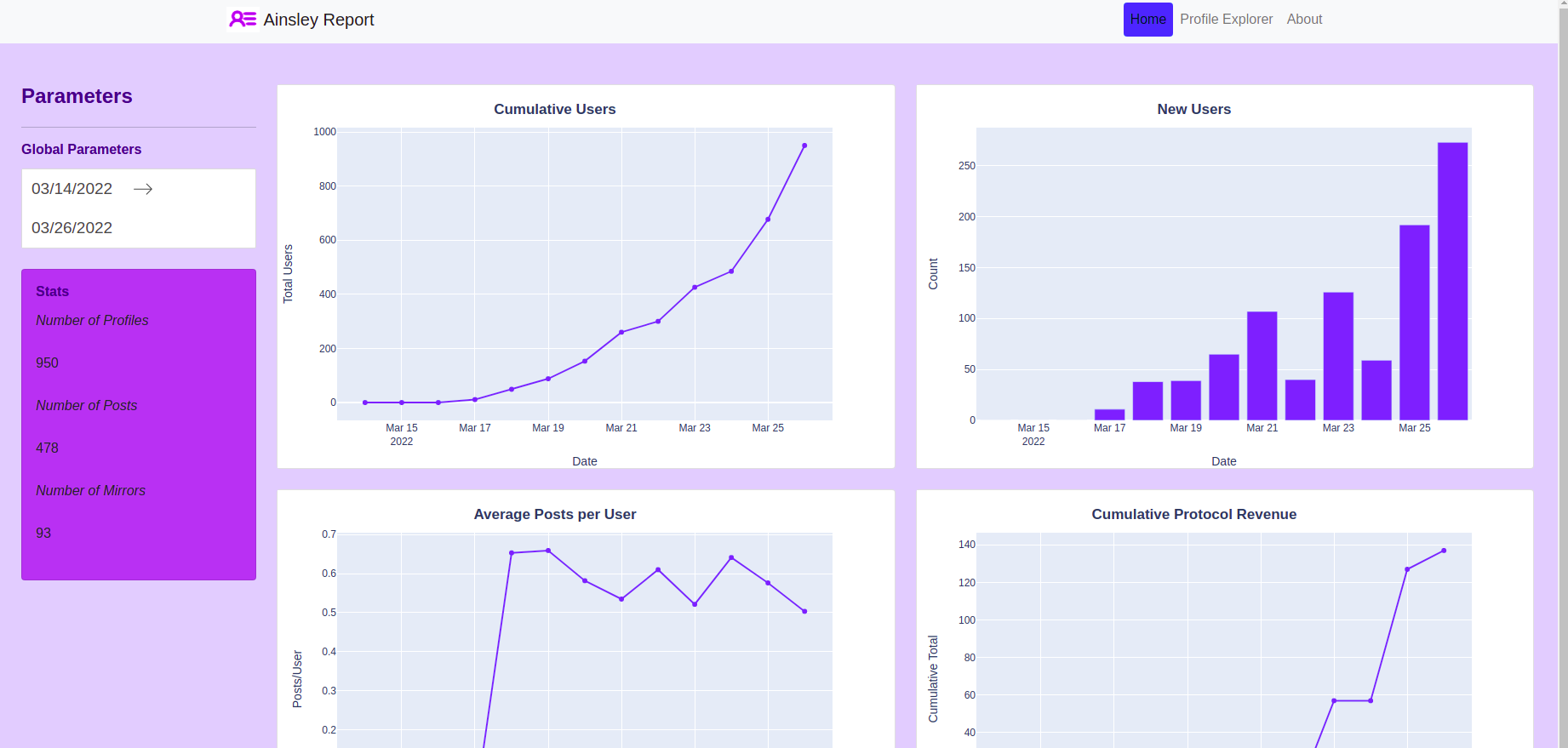
The Ainsley Report is a data analysis dashboard reporting key metrics of Lens Protocol adoption and usage. This is meant to be the go-to place to gauge the health of the network.

Project Description
Ainsley
Welcome to the Ainsley Report, the only place to be to see all of the important metrics of the Lens Protocol Ecosystem. Presenting this data in a simple and accessible way is important to show the health and growth of the network. Whether you are a developer, user, investor or curious this will be essential information.
Key Metrics
-Total number of profiles in time series format
-Revenue generated by the protocol in a time series format
-Key metrics of total posts, follows, profiles etc.
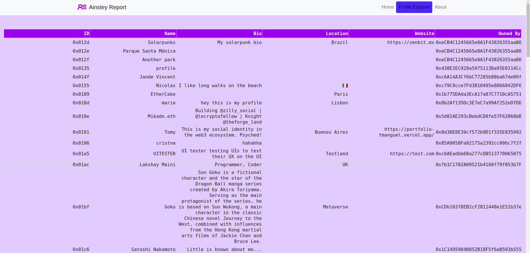
Profile Directory
In addition to the data dashboard you can also use the Ainsley Report to find information on specific profiles. We present a large table of all profiles with names attached, further verisions will have search and grouping functionality.
How it's Made
We use graphQL to query API requests to the Lens API. This is done for both global statistics as well as the profile data from id. Using this data, we create a dataframe and present it in either plot or text form using dash. The web service is run as a flask app locally, with plans to go live (by the time Lens does!). The front end uses a lot of finity components, provided by Polygon. We were really excited to be able to use graphQL (totally foreign to us) in order to query the lens API. Having the whole thing run on python feels a bit hacky, but overall we are extremely happy with project and we hope you enjoy it as much as we do.

