Out Of Gas
Data visualization tool that categorizes and displays Ethereum transactions based on gas prices.
Project Description
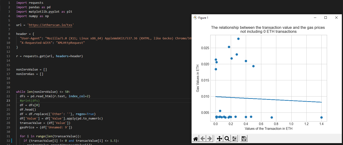
This projects is targeted at newcomers into the Ethereum system and Cryptocurrencies in general where they might have a difficult time getting used to transactions with Ether and gas. We used the data provided from Etherscan that contained the transaction values and gas prices corresponding to them. So this project was to have a visual representation of the correlation between transaction values vs gas prices and plotting them using a scatterplot with a trendline fitted. This provides the users a better sense of what gas is inputted for various transaction values and would help them to decide on a gas price for their own transactions.
How it's Made
This project uses pandas to get the data from etherscan by scraping the website and getting different requests from them. Used numpy to settle them into arrays so the data can be better classified and organized. Then it uses matplotlib to general a graph and fit a trendline through it to give a better visual representation of the data.

